Overview
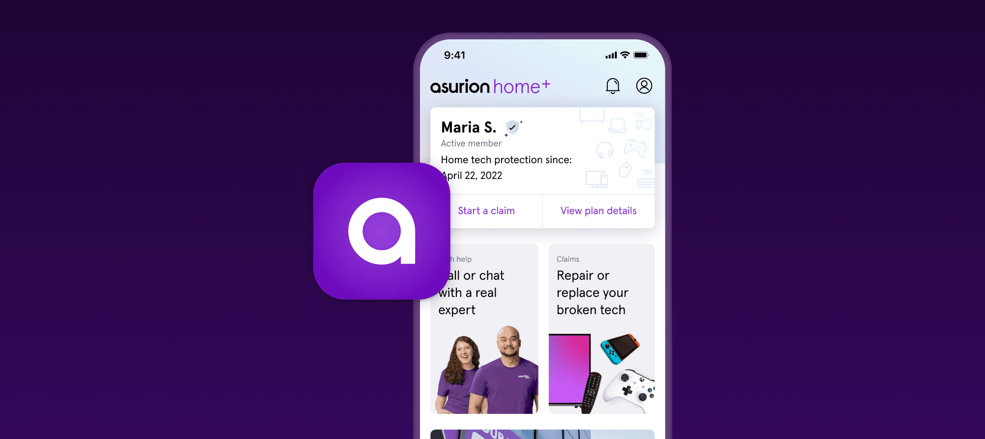
The Asurion App was redesigned to become a helpful artifact that Asurion Home+ customers could use to get fast, simple help for tech support as well as the ability to start and access claims quickly. The app also served as a way to find the nearest uBreakiFix repair store and learn more about how their current and future devices are protected.
Problem
Before the redesign, the Asurion App engagement was very low with low monthly active users, as well as no clear way to use core benefits as a customer such as managing claims, learning about coverage, finding a store, etc. Overall, customers found the app unhelpful and struggled to file claims from within the app.
Process
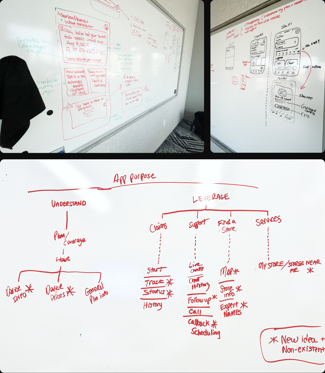
Based on customer feedback and data, the focus was to improve the foundation of the Asurion app through a series of improvements. Before diving into Figma, I collaborated with the team to strategize the best approach for the app redesign based on the data available and customer feedback. Through a few whiteboard sessions, I designed what we had envisioned the app to become. Something that felt fresh and friendly to Home+ customers.
After the first round of designs, we did some user interviews with User Testing to get some quick feedback, which led to v2.0 designs that satisfied all of the customer needs we wanted to address.
Execution
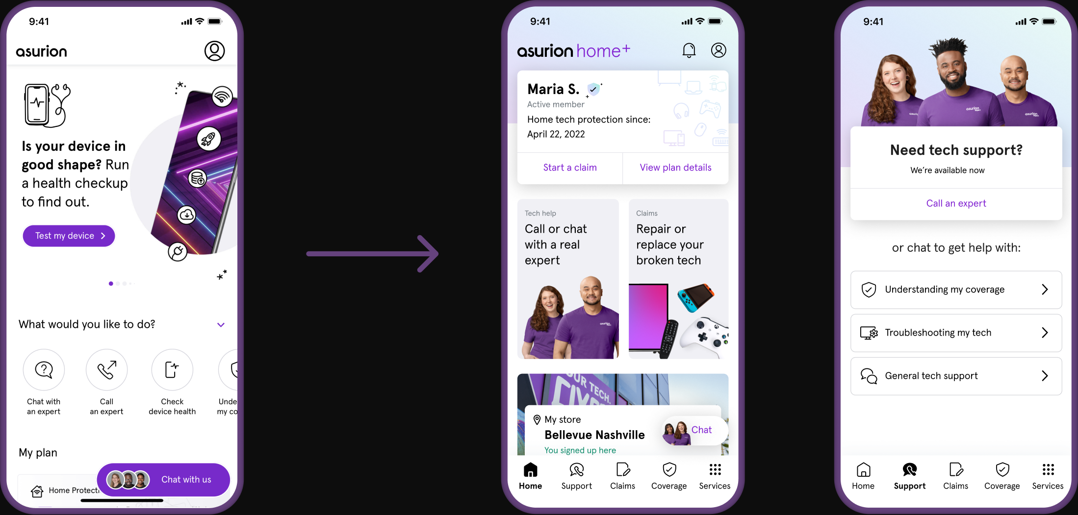
We redesigned the Asurion App with thoughtful care for everything our customers wanted while keeping Asurion's goal of reducing churn for Home+. Here's what was created:
Outcome
Overall, the Asurion App redesign received positive performance and reactions from customers. Home+ subscribers felt it was significantly easier to get support and start claims when needed.
- >10k Home+ monthly active users — 3x increase from previous
- 2.5% lower churn rate than non-app users
- >20% first 7-day app adoption